This guy has spent years mastering this technique and very generously shares it with us:
Monday, March 17, 2008
Great Stencil Tutorial


Friday, March 7, 2008
Fit.
It's my largest garment bugbear. Not only do I have to find the shirt with the right color, style, and texture, I have make sure it will fit. I don't have the strangest body. Why is it so hard to find a good shirt? Well, one constant I have discovered: fit correlates directly with quality. Sure, every so often we run into a great shirt that's cheap and looks great on us. In general, however, manufacturers of higher quality shirts spend that extra little bit of time on fit.
Unfortunately, many t-shirt designers spends enormous amounts of time and talent on t-shirt art and end up putting it on poor quality shirts. I have my favorites: American Apparel and Alternative Apparel. I have my least favorites: Hanes, FOTL, etc. I do not want to denigrate the names of the aforementioned companies. I have many of their shirts and they serve a purpose. I am only rendering an opinion on what works for me and what I think will work for others. With that said, I plead with designers: focus on art and canvas.
Wednesday, March 5, 2008
Texture
Just like in cooking, texture is an important part of t-shirt art. I guess we can say that texture itself is an important part of any art. In Photoshop, you can achieve texture in a variety of ways. I have been experimenting with texture brushes. I used three different, custom brushes to create the following margle-like texture:
Here are the Photoshop brushes I created and used to do the above:
Great Shirt Graphic Tutorial
Some great tips regarding design and t-shirt production. Requires a pdf download.
Photoshop t-shirt design tutorial
Useful Dingbats
Here's a site I ran across that gives some great dingbat graphics that would very useful given out recent discussion on grunge:
Useful and Free Dingbat Fonts
Tuesday, March 4, 2008
Grunge. What it is and how to get there.
Remember early punk rock? In all of it's manifestations, music, dance, fashion, it embodied rebellion against what society defined as acceptable. Punk rock angrily stood forth in defiance of traditional values. Grunge exists as a modern cousin of punk. Here is what the Oxford Dictionary has to say:
grunge / grənj/ • n. 1. grime; dirt. 2. (also grunge rock) a style of rock music characterized by a raucous guitar sound and lazy vocal deliverythe fashion associated with this music, including loose, layered clothing and ripped jeans.
I would dare to add grunge art as a manifestation of grunge rock. It's dirty, unpredictable, rebellious, and urban. Practically, it contains a grainy texture, dark or muted colors, and frequently random elements.


"So," you ask, "How do I achieve this look on my shirts?" Well, I'm not smart enough to tell you, but these people are:
http://www.layersmagazine.com/designing-ultra-scenexcore-apparel.html
http://graphic-identity.blogspot.com/2008/02/design-style-tutorial-grunge-urban-art.html
http://www.sitepoint.com/article/design-project-get-grunge
Good luck and have fun.
Sunday, March 2, 2008
What's your number?
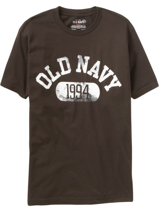
The college shirt is another trend I have seen and aped in my shirts. I'm not the only one either.
So, how to achieve this look? We spoke previously about the aging or wearing of graphics. I posted links to several tutorials reviewing these techniques. The next step is choosing the fonts. Luckily, there are multiple site that offer any number of fonts for free. Of course, you have to choose fonts that mimic those seen on college shirts. Google search images for college shirts to get an idea of the fonts or go to the A&F website. Here are some great font archives:
http://www.dafont.com/
http://www.1001freefonts.com/
http://www.getfreefonts.info/
Finally, the size and placement of the font. Here is where your artistic sense of balance and harmony comes in. Play around with the size and arrangement until you feel right. Good Luck!
Subscribe to:
Posts (Atom)