The college shirt is another trend I have seen and aped in my shirts. I'm not the only one either.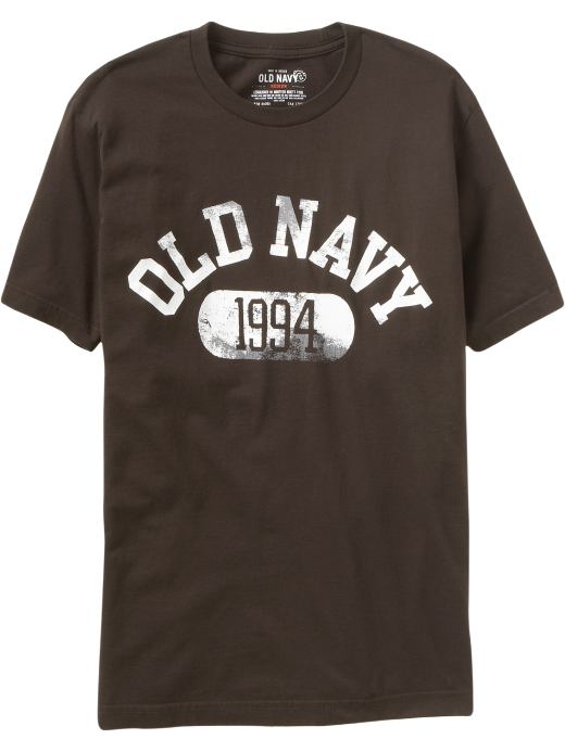
 So let's analyze what makes these shirts popular. First, we immediately see the worn or 'grunge' lettering. This ties into the afore mentioned 'used shirts are more comfortable' idea. When you see the shirt it gives an impression of a comfortable shirt that has been worn often. Secondly, the college theme suggest youth and virility. You can imagine the shirt would look differently on a 50 year old with a gut than on a 20 year old with a six pack. Finally the size and type of fonts used are large, bold, but unassuming. These were chosen to give a utilitarian feel to the shirt. "Oh, this shirt? It's just something I've had laying around. I don't even know what it says. Oh? I'm a walking billboard? I didn't even know...."
So, how to achieve this look? We spoke previously about the aging or wearing of graphics. I posted links to several tutorials reviewing these techniques. The next step is choosing the fonts. Luckily, there are multiple site that offer any number of fonts for free. Of course, you have to choose fonts that mimic those seen on college shirts. Google search images for college shirts to get an idea of the fonts or go to the A&F website. Here are some great font archives:
http://www.dafont.com/
http://www.1001freefonts.com/
http://www.getfreefonts.info/
Finally, the size and placement of the font. Here is where your artistic sense of balance and harmony comes in. Play around with the size and arrangement until you feel right. Good Luck!
Sunday, March 2, 2008
What's your number?

Subscribe to:
Posts (Atom)