Friday, March 28, 2008

Sources for Vector Images

Purchasing or finding creative commons vector images is a strategy that many artists and I use to save time and add complexity to our shirts. I would also venture to guess that many of the t-shirts you see marketed have at least some purchased vector images. Using these images does not suggest that you forgo using creativity to create a design. The vector art is used as a medium rather than a subject. Here are some examples:


Here is a good thread regarding vector images and where to find them:


Here is where I have found some great images at a reasonable price:

Digg this

Monday, March 17, 2008

More Stencils!

Digg this

Great Stencil Tutorial

This guy has spent years mastering this technique and very generously shares it with us:

Digg this

Friday, March 7, 2008

Fit.

It's my largest garment bugbear. Not only do I have to find the shirt with the right color, style, and texture, I have make sure it will fit. I don't have the strangest body. Why is it so hard to find a good shirt? Well, one constant I have discovered: fit correlates directly with quality. Sure, every so often we run into a great shirt that's cheap and looks great on us. In general, however, manufacturers of higher quality shirts spend that extra little bit of time on fit.
Unfortunately, many t-shirt designers spends enormous amounts of time and talent on t-shirt art and end up putting it on poor quality shirts. I have my favorites: American Apparel and Alternative Apparel. I have my least favorites: Hanes, FOTL, etc. I do not want to denigrate the names of the aforementioned companies. I have many of their shirts and they serve a purpose. I am only rendering an opinion on what works for me and what I think will work for others. With that said, I plead with designers: focus on art and canvas.

Digg this

Wednesday, March 5, 2008

Texture

Just like in cooking, texture is an important part of t-shirt art. I guess we can say that texture itself is an important part of any art. In Photoshop, you can achieve texture in a variety of ways. I have been experimenting with texture brushes. I used three different, custom brushes to create the following margle-like texture:
Here are the Photoshop brushes I created and used to do the above:

Digg this

Great Shirt Graphic Tutorial

Some great tips regarding design and t-shirt production. Requires a pdf download.
Photoshop t-shirt design tutorial

Digg this

Useful Dingbats

Here's a site I ran across that gives some great dingbat graphics that would very useful given out recent discussion on grunge:

Useful and Free Dingbat Fonts

Digg this

Tuesday, March 4, 2008

Grunge. What it is and how to get there.

Remember early punk rock? In all of it's manifestations, music, dance, fashion, it embodied rebellion against what society defined as acceptable. Punk rock angrily stood forth in defiance of traditional values. Grunge exists as a modern cousin of punk. Here is what the Oxford Dictionary has to say:

grunge / grÉ™nj/ • n. 1. grime; dirt. 2. (also grunge rock) a style of rock music characterized by a raucous guitar sound and lazy vocal deliverythe fashion associated with this music, including loose, layered clothing and ripped jeans.

I would dare to add grunge art as a manifestation of grunge rock. It's dirty, unpredictable, rebellious, and urban. Practically, it contains a grainy texture, dark or muted colors, and frequently random elements.


"So," you ask, "How do I achieve this look on my shirts?" Well, I'm not smart enough to tell you, but these people are:

http://www.layersmagazine.com/designing-ultra-scenexcore-apparel.html

http://graphic-identity.blogspot.com/2008/02/design-style-tutorial-grunge-urban-art.html

http://www.sitepoint.com/article/design-project-get-grunge

Good luck and have fun.


Digg this

Sunday, March 2, 2008

What's your number?

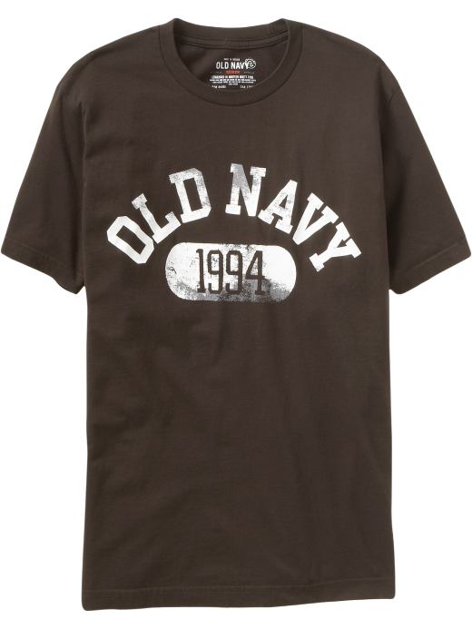
The college shirt is another trend I have seen and aped in my shirts. I'm not the only one either.
So let's analyze what makes these shirts popular. First, we immediately see the worn or 'grunge' lettering. This ties into the afore mentioned 'used shirts are more comfortable' idea. When you see the shirt it gives an impression of a comfortable shirt that has been worn often. Secondly, the college theme suggest youth and virility. You can imagine the shirt would look differently on a 50 year old with a gut than on a 20 year old with a six pack. Finally the size and type of fonts used are large, bold, but unassuming. These were chosen to give a utilitarian feel to the shirt. "Oh, this shirt? It's just something I've had laying around. I don't even know what it says. Oh? I'm a walking billboard? I didn't even know...."
So, how to achieve this look? We spoke previously about the aging or wearing of graphics. I posted links to several tutorials reviewing these techniques. The next step is choosing the fonts. Luckily, there are multiple site that offer any number of fonts for free. Of course, you have to choose fonts that mimic those seen on college shirts. Google search images for college shirts to get an idea of the fonts or go to the A&F website. Here are some great font archives:

http://www.dafont.com/
http://www.1001freefonts.com/
http://www.getfreefonts.info/

Finally, the size and placement of the font. Here is where your artistic sense of balance and harmony comes in. Play around with the size and arrangement until you feel right. Good Luck!

Digg this

Saturday, March 1, 2008

The Grunge - or - How to make a new shirt look old.

New shirts looking old is all the rage today. You can see it in every store. Target, Walmart, Old Navy, Aeropostale, etc. Achieving that look on your graphics is pretty easy. There are two general approaches. The easiest and most expensive (we always have to pay for convenience) are pre-made photoshop filters. MisterRetro offers some great image filters that can torture your image in an almost infinite number of ways. A cheaper but slightly more labor intensive way to add character to your graphic is using the standard filters offered by photoshop and combining them with textured art. Here are some links to online tutorials for distressing artwork:
One
Two
Three
Four
I have used both and I feel I have more control with the latter. Remember to take into account how the shirt will be printed and what color blank you will use. Some printing techniques used to print on dark shirts first put down a white layer before printing the colored layer. This will frequently lead to a less than desirable final result (a la CafePress).

Digg this

What makes a good t-shirt?

I don't know if I have figured out the formula for a good t-shirt. I know it when I see and wear one but why is it good? Obviously there is a component of fit and feel. The fabric has to hang well and caress the skin. But what of the design? I think a balance exists within the design. It has to complement the shirt as much as the shirt complements the design. The colors have to be right. The texture must harmonize.
I think most people would agree that a worn in t-shirt "feels" better than a new one. There may be a component of current fashion in the statement but, in general, worn cloths feel better than new clothes. There may be exceptions. Jeans, however, are the prime example of a material that conforms to the wearer. The more you wear a pair, the more comfortable they become.
I recently came across an interview in GQ magazine (March 08, I think) where a well known hair stylist stated that he never washed his jeans, just threw them in the ocean and let them dry. Perhaps an extreme. To that end I researched reasonably easy techniques to "age" a new t-shirt. There are multiple methods but the one I tried was soaking the shirt in salt and white vinegar for a couple of days then washing and drying it. I got mediocre results. I also tried borax and salt soaks. Again, mediocre results. The shirt came out better than it was but not how I wanted it. Suggestions?

Digg this

Ahhhh...Smell the freedom of the wide open Net!

Hello?
Whoa.
I think there's an echo. Bob? Is that you in the back? No? OK.
Well, I guess people are still coming in so let me go ahead and start.
Can everyone hear me? Is the mic working? OK.
Well, I've been spending an inordinate amount of time on my new obsession, t-shirts, so I thought I would share some of my diligent work with others of the same ilk. I'm going to talk about design, fashion, fabric, graphics, technique, marketing, color, tools, and any other thing that I can find that goes into making our favorite t-shirt. The one we want to wear all the time but have to wash just because people started complaining. There aren't many. They are hard to find. We may even go a long time without one. But, when it comes into your world, your stuck. It's like falling in love. This shirt feels good and it makes you look good. What else can you ask for?
A little obsessive? Perhaps. Maybe it's just my mood.
OK. Let's start with some useful links I have found and maybe later I'll go into my t-shirt past.

Design: Great site that allows you to vectorize any graphic file you have laying around so it will be compatible with Adobe Illustrator and other vector art programs. I've used this multiple times. It used to be free but they are, unfortunately, cashing in. Good for them.
VectorMagic.com

Digg this